Presidential News, take 1
One of the ongoing laments in the current presidential administration is that the news around the presidency is coming fast and furious. It’s hard to keep up. In this first stab at synthesizing presidential news, I grab all of the stories published in the New York Times and the Wall Street Journal that mention Trump in the lead. You can see more details about the article acquisition on the github page. I’ve been updating the scripts each month, so at this point, we have all of the newspaper stories from these sources through October (and it’s high time to start posting about it).
After reading the articles into R, I extracted some article metadata (title, date, author, source, length, oped vs. news, and the first 500 words of the piece) and turned these into a Quanteda corpus. From January 20, 2017 through October 31, 2017 we have 10,497 articles. I removed news items with less than 100 words (these turned out, largely, to be corrections, quotations of the day, or caption items), leaving 10,283 news items. Let’s have a look, shall we?
rm(list=ls())
library(dplyr)
library(tidyr)
library(ggplot2)
library(quanteda)
library(scales)
library(wordcloud)
library(RColorBrewer)

setwd("~/Box Sync/mpc/dataForDemocracy/newspaper/")
load("workspaceR/newspaperExplore.RData")

table(qmeta2$pub)
##
## NYT WSJ
## 6687 3596We have fewer articles for The Wall Street Journal; a part of that is due WSJ’s less frequent publication schedule, with no Sunday paper.
# Create date breaks to get select tick marks on graph
date.vec <- seq(from=as.Date("2017-01-20"), to=as.Date("2017-11-03"), by="week")
# Number of stories by day
p <- ggplot(qmeta2, aes(x=date))
p + stat_count(aes(fill=..count..), geom="point") +
  facet_wrap(~ pub) +
  scale_x_date(labels = date_format("%m/%d"), breaks=date.vec) +
  ggtitle("Volume of News Coverage of Trump\n New York Times and Wall Street Journal") +
  labs(x="Date", y="Number of Stories") +
  theme(axis.text.x=element_text(angle=90),
        plot.title = element_text(face="bold", size=20, hjust=0),
        axis.title = element_text(face="bold", size=16),
        panel.grid.minor = element_blank(),
        legend.position="none")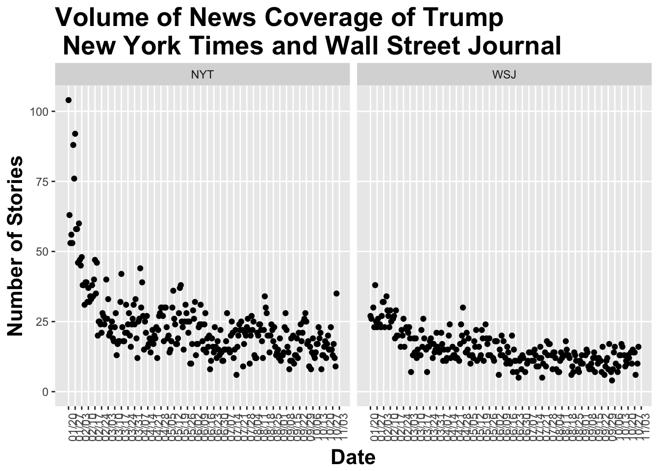
While the NY Times initially had considerably more coverage of Trump, the two papers have stabilized around a similar volume of news articles mentionining him or his presidency in the lead each day – about 18 articles on average for the NYT and 11 for the WSJ.
Just for fun, let’s look at complexity of the news coverage, using the Flesch-Kincaid readability index.
## Readability/Complexity Analysis (from quanteda)
fk <- textstat_readability(qcorpus2, measure = "Flesch.Kincaid") # back to qcorpus2 (with stopwords)
qmeta2$readability <- fk

# Plot
p <- ggplot(qmeta2[qmeta2$readability<100,], aes(x = date, y = readability))
p + geom_jitter(aes(color=pub), alpha=0.5, width=0.25, height=0.0, size=2) +
  geom_smooth(aes(color=pub)) +
  scale_x_date(labels = date_format("%m/%d"), breaks=date.vec) +
  ggtitle("'Readability' of Newspaper Coverage of Trump") +
  labs(y = "Readability (grade level)", x = "Date of Article") +
  scale_color_manual(values=c("blue3","orange3"), name="Source") +
  theme(plot.title = element_text(face="bold", size=20, hjust=0),
        axis.title = element_text(face="bold", size=16),
        panel.grid.minor = element_blank(), legend.position = c(0.95,0.9),
        axis.text.x = element_text(angle=90),
        legend.text=element_text(size=10))
The WSJ stories appear to be written at a slightly higher grade level than do the NYT stories, though both hover around 13 (roughly equivalent to a first-year college reading level).
Finally, before moving into more nitty gritty of the presidential news, here’s a quick wordcloud of pieces from the NYT and from the WSJ, plotting the 200 most frequently occuring unigrams and bigrams.
# Wordcloud by source
bypaperdfm <- dfm(qcorpus_tokens, groups = "pub",
                  remove = c(stopwords("english")),
                  remove_punct = TRUE, ngrams = 1:2, verbose = TRUE)

palO <- colorRampPalette(brewer.pal(9,"Oranges"))(32)[13:32]
palB <- colorRampPalette(brewer.pal(9,"Blues"))(32)[13:32]

textplot_wordcloud(bypaperdfm[1], max.words = 200, colors = palB, scale = c(4, .5)) # nyt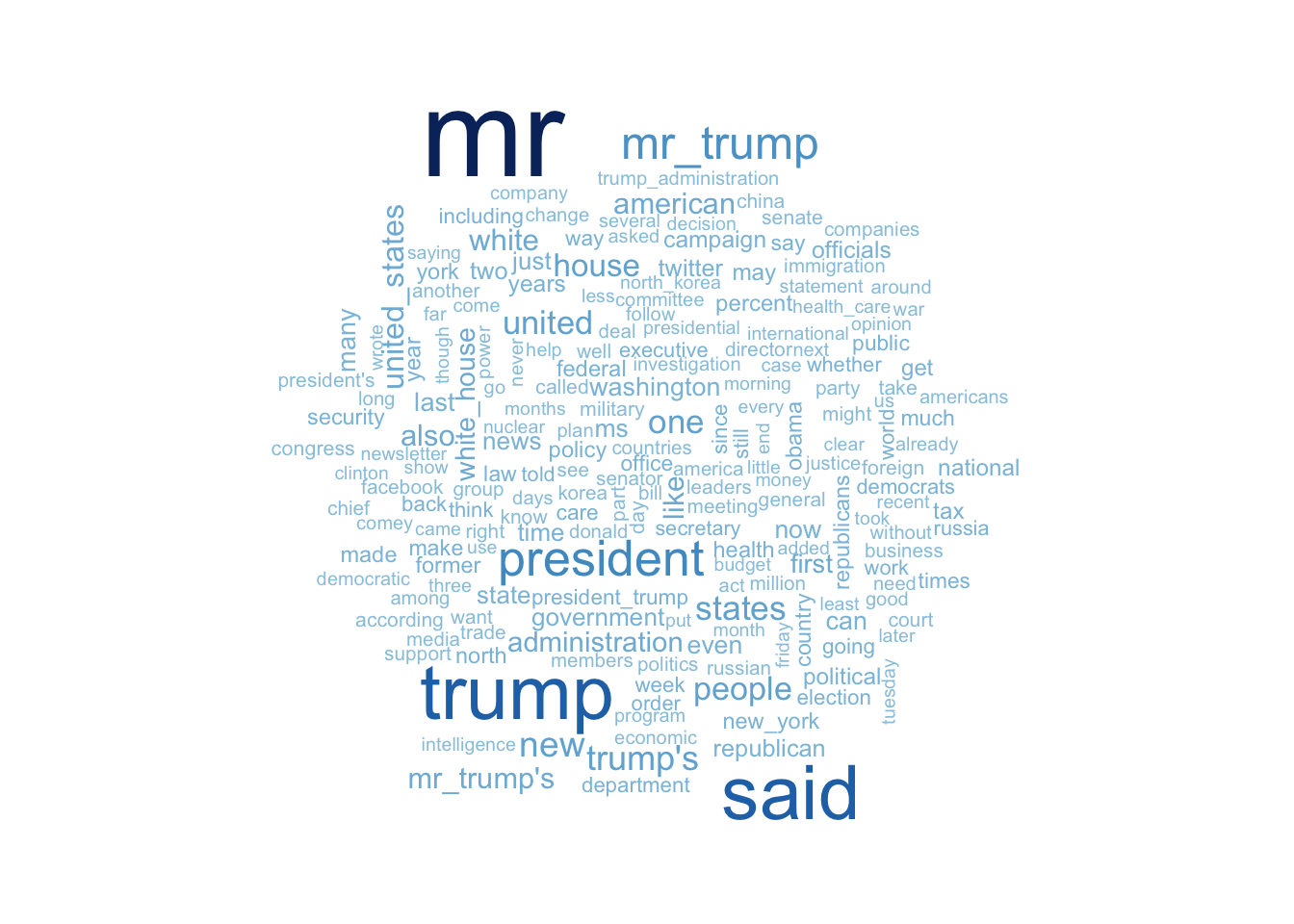
textplot_wordcloud(bypaperdfm[2], max.words = 200, colors = palO, scale = c(4, .5)) # wsj
In truth, I rarely see anything illuminating in wordclouds, though it seems clear the NYT (blue) refers to the “United States”" less frequently than the WSJ (orange). But both have a lot of “Mr. Trump”“, and many references to what somebody”said." I’ll promise some more interesting comparisons to come!